When it comes to web design, choosing the right font is more than just an aesthetic decision—it plays a vital role in user experience and readability. One font that has garnered attention for its elegance and readability is Ibarra Real Nova. Inspired by 18th-century Spanish typography, this serif font brings a classic, sophisticated vibe to modern web designs, making it a popular choice for websites aiming to convey cultural richness or scholarly prestige.
In this article, we’ll delve into the best practices for incorporating Ibarra Real Nova into web design. From pairing the font with complementary typefaces to ensuring that it loads efficiently across devices, this guide will provide practical tips for using this versatile font in your next web project. Whether you’re a designer looking to refine your work or a beginner looking to enhance your site’s look, this article will break down everything you need to know.
Ibarra Real in Web Design
| Key Aspect | Details |
|---|---|
| Font Origin | Ibarra Real Nova is a modern revival of 18th-century Spanish typography, designed by José Ribagorda and Octavio Pardo. |
| Best Font Pairings | – Manrope: Clean, geometric contrast- Montserrat: Modern and professional- Merriweather: Balanced classic |
| Use in Web Design | Ideal for headings, subheadings, and pull quotes due to its elegant, authoritative appearance. |
| Responsive Design Tips | Mobile: 12–16pt, Tablet: 15–19pt, Desktop: 16–20pt. Ensure a line length of 50-75 characters. |
| Web Performance Tips | Use WOFF2 for modern browsers and subset fonts to reduce file sizes. |
| Cultural Significance | Adds a touch of historical Spanish charm and sophistication, perfect for projects with cultural themes. |
Ibarra Real Nova is a stunning typeface that brings sophistication, history, and elegance to web design. Whether you’re working on a site with cultural or literary themes, or you simply want to create a more refined look, this font provides a perfect balance of beauty and functionality. By following best practices in font pairing, responsive design, web performance, and accessibility, you can ensure that your website offers a visually striking and user-friendly experience.
With its versatility and cultural significance, Ibarra Real Nova can be a powerful tool in your web design toolkit.
What is Ibarra Real Nova?
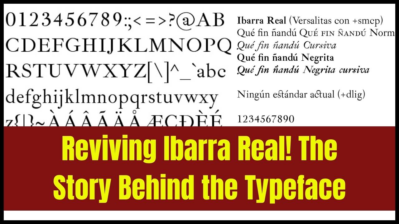
Ibarra Real Nova is a serif typeface that draws inspiration from the Imprenta Real, the Royal Press of Spain, and was used in the first editions of classic works like Don Quixote in the late 18th century. Designed by José María Ribagorda and Octavio Pardo, this typeface was released under the SIL Open Font License, making it available for both personal and commercial use.
The typeface’s design features beautiful serifs and elegant curves, giving it a timeless look while still being highly legible on digital screens. Unlike many traditional fonts that can feel heavy or difficult to read on a screen, Ibarra Real Nova has been fine-tuned for web use. It offers the perfect balance between sophistication and readability, which is why it has become a favored choice among web designers looking to add a historical or scholarly flair to their websites.
Why Use Ibarra Real Nova in Web Design?
When choosing fonts for your website, it’s essential to consider the overall mood and message you want to convey. Ibarra Real Nova is particularly well-suited for projects that require a sense of elegance, refinement, or cultural richness. Here are some specific reasons why web designers choose this typeface:
- Historical Appeal: Perfect for websites with a literary, historical, or cultural theme. Its ties to the Don Quixote edition give it a sense of gravitas and intellectual heritage.
- Visual Aesthetics: Its elegant serifs and balanced letterforms can elevate the overall design of any webpage, adding a sophisticated and professional touch.
- Readability: Despite being a serif font, Ibarra Real Nova has been optimized for legibility on screens, making it a great choice for both large blocks of text and headings.
- Versatility: It pairs well with modern sans-serif fonts, making it adaptable to various design styles, from minimalistic to vintage-inspired layouts.
By incorporating Ibarra Real Nova into your web design, you’re not just using a beautiful typeface—you’re enhancing your website’s visual appeal and reinforcing its message, whether you’re working on a literary blog, an educational site, or a project with a cultural focus.
Best Practices for Using Ibarra Real Nova in Web Design
1. Font Pairing: Create a Balanced Typographic System
One of the most important aspects of font selection is pairing fonts that complement each other. While Ibarra Real Nova is elegant and sophisticated, it’s best paired with modern sans-serif fonts to maintain readability and create a visually pleasing contrast.
Here are some excellent pairings to consider:
- Manrope: This clean, geometric sans-serif font works beautifully alongside Ibarra Real Nova, creating a modern, professional look while preserving the elegance of the serif font.
- Montserrat: A popular sans-serif font, it offers a contemporary feel that pairs well with the traditional style of Ibarra Real Nova, creating a balanced design.
- Merriweather: If you prefer another serif font, Merriweather offers excellent readability and a classic feel, complementing Ibarra Real Nova in a harmonious way.
- Spectral: This serif typeface shares a similar aesthetic, but with a more modern approach. It’s perfect for maintaining an elegant look throughout your design.
- Lora: A serif font with a well-balanced structure, Lora pairs effortlessly with Ibarra Real Nova for a consistent and sophisticated typographic theme.
2. Typography Hierarchy: Guide the User’s Eye
When designing a website, typographic hierarchy is key to ensuring your content is organized and easy to read. Use Ibarra Real Nova strategically in your hierarchy:
- Headings & Titles: Make headings and titles stand out with larger font sizes. The distinctive design of Ibarra Real Nova works well to capture attention.
- Subheadings: Use smaller sizes of Ibarra Real Nova or opt for a complementary sans-serif for subheadings to maintain a clear structure.
- Body Text: For the body, pairing Ibarra Real Nova with a clean sans-serif ensures the content is legible and well-structured, without overwhelming the reader.
By adjusting font weights, sizes, and spacing, you can direct the reader’s attention to important sections of your website, making navigation easier and the content more digestible.
3. Responsive Typography: Ensure Legibility Across Devices
Typography isn’t just about how the font looks—it’s also about how it works across different devices and screen sizes. To ensure Ibarra Real Nova maintains its legibility, follow these guidelines for responsive typography:
- Mobile Devices: Use a font size between 12–16px for smaller screens, ensuring the text remains readable without requiring zoom.
- Tablets: For tablet devices, aim for a font size between 15–19px to ensure the text remains legible and doesn’t become too crowded.
- Desktop: On desktop screens, you can go for a slightly larger font size of 16–20px, depending on the design of your site.
Additionally, Ibarra Real Nova should be used with a line height of 1.4–1.6 times the font size, ensuring that the text remains clear and easy to read. Avoid using long paragraphs without sufficient spacing, as this can create a cluttered look and make reading difficult.
4. Web Performance Optimization: Speed Up Your Website
Fonts are one of the elements that can affect your website’s loading speed. Fortunately, there are some best practices to ensure that Ibarra Real Nova loads quickly without negatively impacting performance:
- Use WOFF2 Format: This modern font format is optimized for web use and is supported by most major browsers. It offers superior compression and faster load times compared to other font formats.
- Subset Fonts: If your website only uses a limited set of characters, consider subsetting the font to include only the necessary characters. This can significantly reduce the file size and improve load times.
- Font Loading Strategy: To prevent text from being invisible while the font is loading, use the
font-display: swap;property in your CSS. This allows the browser to show fallback fonts while Ibarra Real Nova loads, ensuring a smooth user experience.
5. Using Ibarra Real Nova for Specific Web Design Elements
Ibarra Real Nova works best in specific elements of your website. Here are some examples of where to use it effectively:
- Headings & Titles: Use Ibarra Real Nova for impactful headings, subheadings, and pull quotes. Its intricate design will immediately grab attention.
- Body Text: For body text, consider pairing Ibarra Real Nova with a more neutral, modern sans-serif font like Manrope or Montserrat. This ensures that your content is easy to read while still maintaining an elegant aesthetic.
- Call-to-Action Buttons: If you’re aiming for a more formal or classical design, Ibarra Real Nova can also be used for buttons or call-to-action text.
6. Accessibility: Make Your Site Inclusive
Web accessibility is crucial for providing an inclusive user experience. Ibarra Real Nova, while beautiful, may present some challenges for users with visual impairments if not used correctly. Here are some tips to ensure accessibility when using this typeface:
- Contrast: Ensure that there’s a high contrast between your text and background, especially when using Ibarra Real Nova for body text. This helps users with low vision or color blindness read your content without difficulty.
- Font Size: Make sure the font size is large enough, with sufficient line height and spacing, to support readers with dyslexia or visual impairments.
- Avoid Overuse: For accessibility purposes, avoid overusing Ibarra Real Nova in lengthy paragraphs. Pairing it with modern sans-serif fonts can make the design more readable for a wider audience.
7. Cultural and Historical Significance
The Imprenta Real from which Ibarra Real Nova draws its inspiration has a deep historical and cultural significance, particularly in Spain. By using this font, you’re not just selecting a beautiful typeface—you’re connecting your website to a rich literary and cultural tradition. This can be particularly important for projects related to literature, history, or cultural heritage, where the use of a historically inspired typeface can enhance the narrative and visual appeal of your website.
Frequently Asked Questions (FAQs)
1. Is Ibarra Real Nova free to use?
Yes, Ibarra Real Nova is free to use for both personal and commercial projects, as it is released under the SIL Open Font License.
2. Can I use Ibarra Real Nova for body text?
While Ibarra Real Nova is an excellent choice for headings, titles, and quotes, it’s also legible enough for body text, especially when paired with a complementary sans-serif font for better readability.
3. What is the best way to pair Ibarra Real Nova with other fonts?
Pair Ibarra Real Nova with modern sans-serif fonts like Manrope or Montserrat for optimal readability and balance. Avoid pairing it with other ornate serif fonts, as this can make the design feel too busy