The Real Academia Española (RAE) has significantly shaped the linguistic and typographic landscape of the Spanish language, influenced not just language norms but also design practices. For over 300 years, this institution has upheld linguistic purity and consistency, and its impact extends far beyond dictionaries and grammar rules into the world of typography. This article explores the RAE’s influence on Spanish design, particularly focusing on typography, its evolution, and modern-day applications.
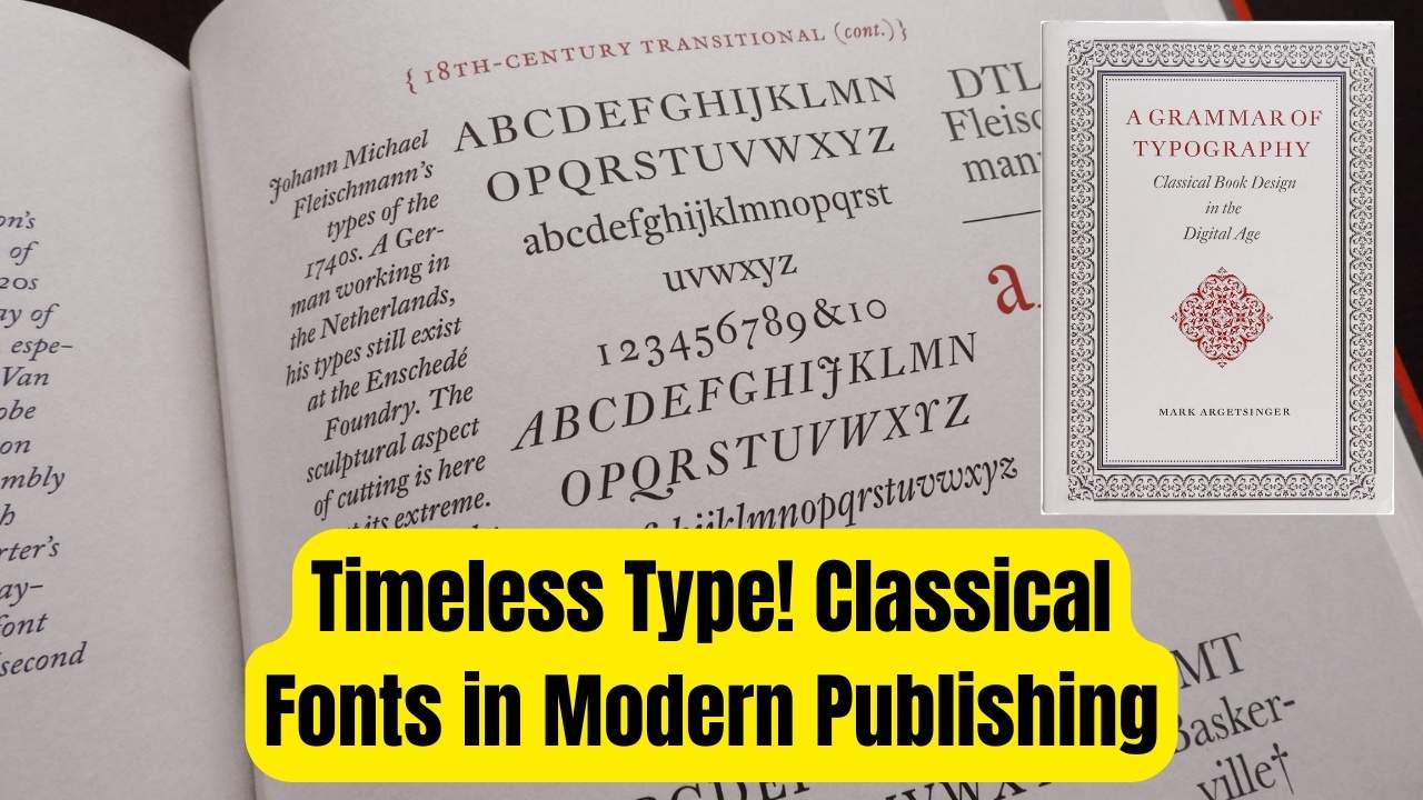
Spanish typography has evolved in tandem with the country’s linguistic history, but it wasn’t until the late 18th century that the RAE’s active involvement with design began to make a profound impact. This article delves into the historical contributions of the RAE, the notable typefaces it helped create, the revival of traditional designs in the digital age, and the lasting influence it continues to have on modern Spanish design.
Typographic Heritage
| Key Point | Detail |
|---|---|
| The Role of the RAE | The Real Academia Española (RAE) has had a significant influence on both Spanish language and typography for centuries. |
| Historical Contribution | The RAE helped create the iconic Ibarra Real typeface in the 18th century, which remains a key element of Spanish design today. |
| The Revival of Ibarra Real | In 2007, Ibarra Real was digitally revived as Ibarra Real Nova, ensuring the continuation of this typographic legacy. |
| Modern Applications | Today, typefaces like Ibarra Real Nova are used in a wide range of design projects, including Google Fonts. |
| Linguistic and Design Unification | The RAE’s linguistic policies help standardize Spanish orthography, influencing cohesive typographic designs across Spanish-speaking countries. |
| Useful Resources | For more information on the RAE’s work, visit www.rae.es. |
The Real Academia Española’s contributions to Spanish design, particularly in typography, have had a lasting and profound impact on how the Spanish language is visually represented. From the creation of the Ibarra Real typeface in the 18th century to its digital revival as Ibarra Real Nova, the RAE has ensured that Spanish typography remains both elegant and functional. Designers today can draw from this rich legacy to create visually striking and linguistically accurate designs that honor Spain’s typographic heritage.
Introduction to the Real Academia Española and Its Role in Typography
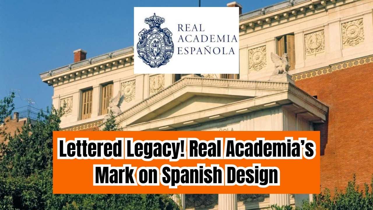
The Real Academia Española (RAE) is not just an institution that codifies language. It has also played a pivotal role in shaping the visual representation of Spanish through type design. The RAE was founded in 1713 in Madrid with the primary goal of ensuring the purity and consistency of the Spanish language. However, as its authority grew, so did its influence over various aspects of the Spanish cultural landscape, including typography.
Typography, as a visual language, is deeply intertwined with the written word. As the RAE worked to standardize the spelling and grammar of Spanish, it inadvertently influenced how the language was visually represented in print. One of its most notable contributions to typography came in the form of a typeface designed by the Spanish printer Joaquín Ibarra in the late 18th century.
The 18th Century: Joaquín Ibarra and the Birth of Ibarra Real
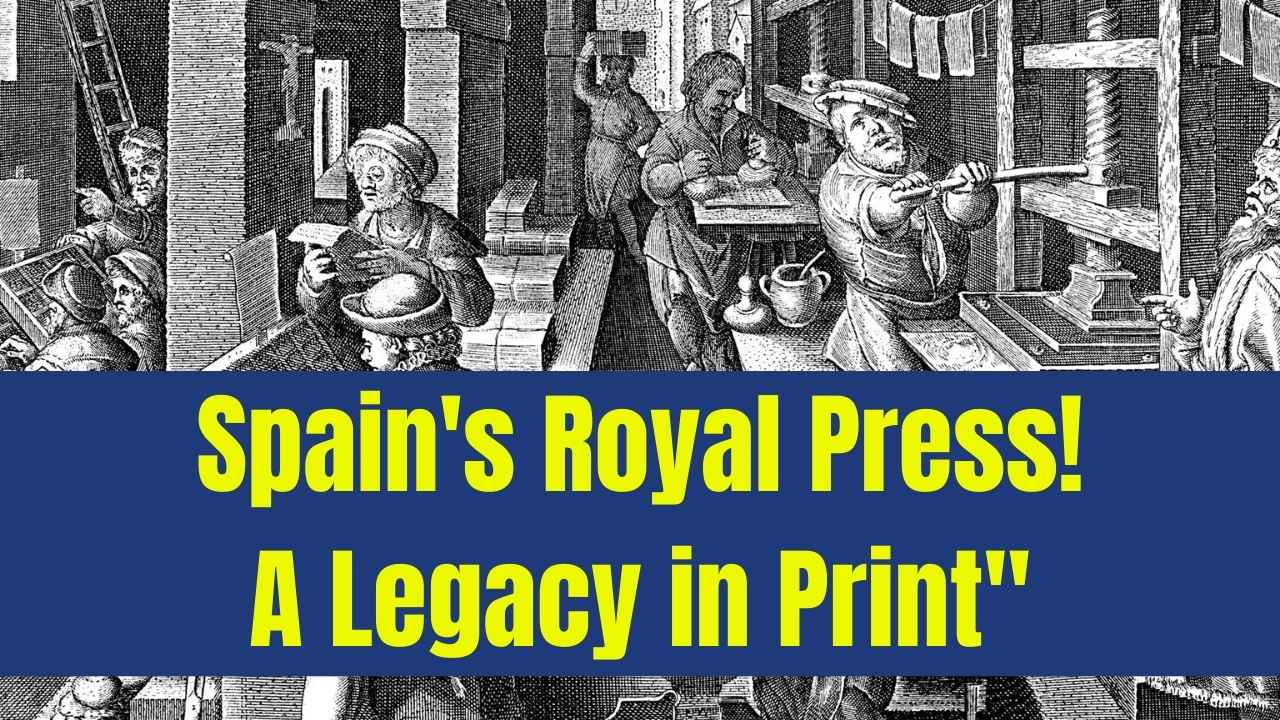
In 1780, Joaquín Ibarra, the Royal Printer to the Spanish Crown, designed a typeface for the RAE’s edition of Miguel de Cervantes’ Don Quixote. This typeface, known as Ibarra Real, was revolutionary in its time. It was based on the neoclassical typefaces of Baskerville, Didot, and Bodoni, which were characterized by their high contrast between thick and thin strokes, sharp serifs, and refined elegance. Ibarra’s design was carefully crafted to improve readability while maintaining a classical, authoritative appearance—perfect for a monumental work like Don Quixote.
The Ibarra Real typeface quickly became a standard in Spanish printing, setting a precedent for typographic design in the Spanish-speaking world. Beyond the design of the typeface itself, Ibarra’s work was groundbreaking in its approach to standardizing type measurements and developing unique ink formulas. These innovations elevated Spanish printing to an international level, influencing the visual style of Spanish literature and academic publications for years to come.
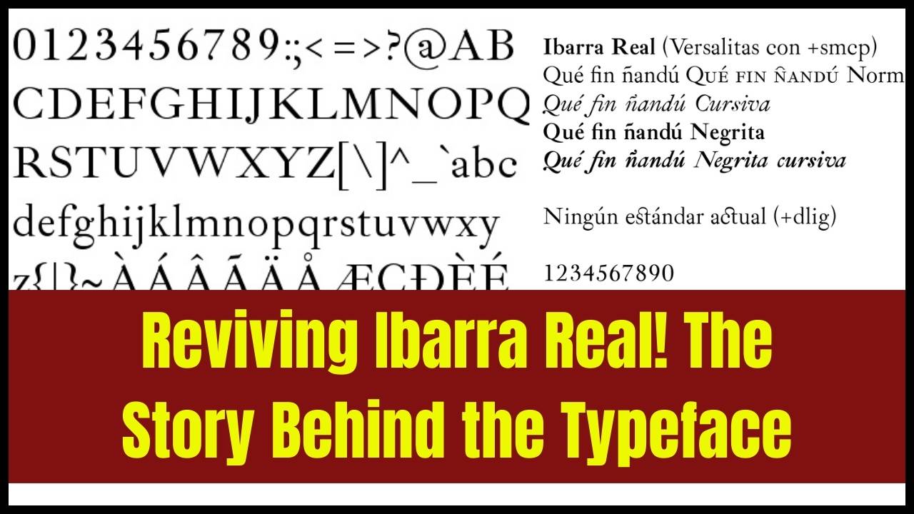
The Digital Revival: Ibarra Real Nova
While the original Ibarra Real was a milestone in Spanish typography, its digital transition posed challenges. In 2007, a group of designers known as Unos Tipos Duros undertook the task of digitally reviving the typeface, giving it a more modern and usable form for contemporary design applications. This revived version, called Ibarra Real Nova, made the typeface accessible to the digital world, providing an accurate reproduction of the original design but with updated features for better legibility on modern screens.
The introduction of Ibarra Real Nova helped bring the typeface back into the public eye, and it is now available for free on Google Fonts, making it accessible to designers worldwide. This digital revival ensures that the RAE’s typographic legacy continues to influence design not just in Spain but across the globe.
The Influence of RAE’s Linguistic Policies on Typography
While the RAE is best known for its work in linguistics, its efforts to standardize Spanish orthography have also had a significant impact on typography. By ensuring consistency in the way words are spelled and accented, the RAE has made it easier for designers to create harmonious and cohesive typographic designs across the Spanish-speaking world.
The pan-Hispanic linguistic policy of the RAE has aimed to create a uniform system of spelling, grammar, and punctuation across Spanish-speaking countries. This policy not only ensures that Spanish remains a unified language but also affects how typography is approached in different regions. Consistent orthography makes it easier to design typefaces that work across multiple Spanish-speaking countries, allowing for the creation of typefaces that are both versatile and culturally appropriate.
Practical Advice: How to Use Spanish Typefaces in Your Designs
For designers working with Spanish typography, it is essential to understand both the historical context and the contemporary applications of typefaces like Ibarra Real Nova. Here are a few tips on how to incorporate Spanish typefaces into your projects:
- Choose Typefaces with Historical Significance: For projects that require a sense of tradition or authority, typefaces like Ibarra Real Nova are ideal. Their deep historical roots and refined design make them perfect for high-end publications, literature, and formal documents.
- Leverage the RAE’s Resources: If you’re working on a project that involves Spanish language usage or typography, consider visiting the RAE’s official website (www.rae.es) for authoritative guidance on spelling, grammar, and style. This will help ensure that your designs are both linguistically correct and visually cohesive.
- Use Modern Digital Variants: While traditional typefaces have their place, digital variants like Ibarra Real Nova are optimized for modern screens and are perfect for web design. They offer improved legibility while still maintaining the aesthetic qualities of their historical predecessors.
- Consider Cultural Variations: While Spanish is a global language, each Spanish-speaking country may have slight differences in spelling and usage. When designing for specific regions, be sure to account for these variations to ensure your typography aligns with local norms.
Frequently Asked Questions (FAQs)
Q1: What is the Ibarra Real typeface, and why is it important?
A1: The Ibarra Real typeface was designed by Joaquín Ibarra in the 18th century for the Royal Academy’s edition of Don Quixote. It is considered one of the most important typefaces in Spanish design due to its historical significance and influence on Spanish printing and typography.
Q2: Can I use Ibarra Real Nova in my projects?
A2: Yes, Ibarra Real Nova is available for free on Google Fonts. It is a modern, digital version of the original Ibarra Real typeface, designed for use in both print and digital projects.
Q3: How does the RAE influence typography?
A3: The RAE influences typography by standardizing the Spanish language, which affects how typefaces are designed and used across Spanish-speaking countries. Its linguistic policies help ensure that typography is consistent and culturally appropriate.
Q4: How can I use Spanish typography in my own designs?
A4: To incorporate Spanish typography into your designs, you can use historically significant typefaces like Ibarra Real Nova, ensure linguistic accuracy by referencing the RAE’s resources, and account for regional variations in spelling and grammar.