The revival of historical typefaces brings a unique blend of old-world charm and modern usability to the digital age. One such revival that has made a significant impact in the typography world is Ibarra Real Nova. This typeface, originally created in the 18th century by Spanish typographer Gerónimo Gil for the printing of Don Quixote, is now available in a digital format, thanks to the dedication and expertise of modern typographers. This article delves into the fascinating story behind the revival of Ibarra Real, examining the historical roots, the challenges faced during its digital transformation, and the cultural importance of the project.
The Making of Ibarra Real
| Key Topic | Details |
|---|---|
| Type of Typeface | Serif, Historical Revival |
| Original Designer | Gerónimo Gil |
| Date of Original Design | 1780 |
| Project Initiation | 2007, by José María Ribagorda |
| Modern Revitalization | Collaborated with Octavio Pardo in 2015 |
| Font Family | Regular, Italic, SemiBold, SemiBold Italic, Bold, Bold Italic |
| Cultural Significance | Preserves Spanish typographic heritage |
| Font License | SIL Open Font License (Free for use and modification) |
| Available Platforms | Google Fonts, Adobe Fonts, Font Squirrel, among others |
The making of Ibarra Real Nova is a testament to the dedication and expertise required to revive a historical typeface for modern use. By blending traditional craftsmanship with contemporary digital design, the project has successfully preserved an important part of Spain’s typographic history. Today, Ibarra Real Nova stands as a bridge between past and present, offering designers worldwide access to a timeless piece of typography.
For anyone looking to incorporate a historical typeface into their work, Ibarra Real Nova offers the perfect balance of elegance, legibility, and versatility.
The Origins of Ibarra Real
The Ibarra Real typeface was originally designed by Gerónimo Gil, a skilled Spanish type designer, in the late 18th century. His work was commissioned for the Royal Spanish Academy‘s edition of Don Quixote, one of the most famous literary works in history. The purpose of the typeface was to create a font that reflected the elegance and dignity of the Spanish language while making the text easy to read and visually appealing.
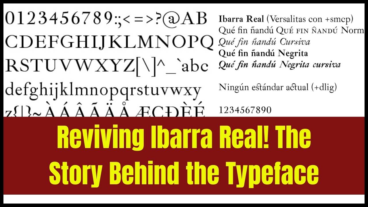
Designed with sharp contrasts between thick and thin strokes, the Ibarra Real typeface showcased the calligraphic style that was popular at the time, which was both formal and decorative. This typeface was used for many important publications in Spain, and its historical significance cannot be overstated.
However, as time went on, the typeface began to fade into obscurity, with many of its characteristics lost or overlooked. Despite its cultural and historical importance, there were very few modern reproductions of Ibarra Real available for contemporary use. This is where the revival project comes in.
The Revival Process: From 2007 to Today
In 2007, José María Ribagorda, a Spanish typographer, set out to preserve Ibarra Real by digitizing it. Ribagorda worked with the Calcografía Nacional Española, an institution dedicated to preserving Spain’s print heritage, to scan and preserve the original metal type from the 1780 edition of Don Quixote. The goal was to make the typeface available for modern use while staying as true as possible to Gil’s original design.
The first step in the revival process was painstaking research into the original font. Ribagorda carefully examined old print materials and consulted with experts to recreate the nuances of the 18th-century design. However, simply digitizing the font wasn’t enough — it needed to be adapted for modern use.
In 2015, the project saw a major breakthrough when Octavio Pardo, an experienced Spanish typographer, joined the team to help refine the digital version. Pardo, who had studied Type Design at the University of Reading, brought his technical expertise to the table. His work focused on improving the legibility and versatility of Ibarra Real for use in modern digital environments. This collaboration led to the creation of Ibarra Real Nova, a more refined and accessible version of the original typeface.
The Historical Context of Typography in Spain
To truly appreciate the importance of Ibarra Real, it’s essential to understand the historical context of typography in Spain. During the 18th century, printing in Spain underwent significant changes, especially with the influence of Baroque and Rococo styles in art and design. This period saw a move toward more elegant and refined typefaces that were suited for publishing the great works of literature.
The Spanish Royal Academy (Real Academia Española) played a crucial role in establishing typographic standards in Spain. It was not just about the aesthetic appeal; typography during this period was also about preserving and enhancing the Spanish language, ensuring that it was communicated in the most beautiful and readable way possible.
Ibarra Real, being commissioned for the famous Don Quixote, is deeply intertwined with Spain’s literary heritage. The revival of this typeface is not only a technical project but a cultural endeavor to keep these historical ties alive.
The Role of Typography in Cultural Identity
Typography is more than just the design of letters. It plays a vital role in shaping cultural identity. In the case of Ibarra Real, this typeface represents Spanish heritage. Its revival ensures that Spanish typographic traditions remain part of the global design landscape.
Typefaces like Ibarra Real are a visual representation of the culture from which they originate. For Spain, fonts like Ibarra Real carry the legacy of its literary past and its role in European typographic development. By preserving such typefaces and making them accessible to designers worldwide, the project reinforces the idea that typefaces are an integral part of cultural expression.
Key Features of Ibarra Real Nova
The Ibarra Real Nova family is a comprehensive typeface that offers a variety of styles to suit different design needs. These styles include:
- Regular
- Italic
- SemiBold
- SemiBold Italic
- Bold
- Bold Italic
This diversity makes Ibarra Real Nova adaptable to various design projects, from body text to headings. Additionally, the typeface offers support for a wide range of languages, ensuring it can be used internationally. It includes key typographic features such as:
- Small Caps: A feature commonly used for stylistic emphasis.
- Ligatures: Specially crafted combinations of characters to improve the flow and appearance of the text.
- OpenType Features: Such as alternate characters and fraction sets, allowing designers to adjust the font for specific needs.
Despite its modern adaptations, the typeface retains the high contrast and calligraphic elegance of the original Ibarra Real. This balance between historical accuracy and modern usability makes it a perfect choice for both digital and print applications.
The Impact of Open-Source Fonts on the Design Community
One of the most significant aspects of Ibarra Real Nova is that it is available under the SIL Open Font License. This means it is free to use, modify, and distribute. The open-source nature of the font is a game-changer for the design community. It allows designers, typographers, and educators to use this historically significant typeface without restrictions, making it more accessible for projects both big and small.
Open-source fonts like Ibarra Real Nova have a profound impact on the typography world. They enable more inclusive design practices by giving designers access to high-quality fonts that would otherwise be out of reach. Moreover, these projects foster collaboration, with designers from around the world contributing to their development and improvement.
Comparisons with Other Revival Projects
The Ibarra Real Nova revival is part of a growing trend in the design world: the revival of historical typefaces. For example, the Garamond typeface, based on designs from the 16th century, has undergone numerous revivals over the years. Similarly, the Baskerville font, designed in the 18th century, has been revived for modern use.
While each revival project is unique, they share a common goal: to preserve the rich legacy of historical typefaces and make them relevant to today’s design needs. Ibarra Real Nova stands out because of its deep cultural significance and its connection to one of the world’s greatest literary works, Don Quixote.
Practical Applications of Ibarra Real Nova
Ibarra Real Nova’s modern adaptation makes it an ideal choice for a wide range of design projects, from books to websites, and even branding. Here are a few practical applications:
- Books and Publications: Due to its historical roots, Ibarra Real Nova is perfect for books, especially those with a classical or literary theme. Its legibility and elegance make it ideal for body text.
- Web Design: Ibarra Real Nova’s digital optimization ensures it looks great on all screen sizes, making it suitable for use on websites and blogs.
- Branding and Logos: The sophisticated style of Ibarra Real Nova lends itself well to luxury or heritage-focused brands.
- Academic and Cultural Projects: Given its historical significance, Ibarra Real Nova is an excellent choice for academic publications, museums, and cultural institutions.
Frequently Asked Questions (FAQs)
Q1: Can I use Ibarra Real Nova for free?
Yes! Ibarra Real Nova is available under the SIL Open Font License, meaning it’s free to use for personal, educational, and commercial projects.
Q2: Where can I download Ibarra Real Nova?
You can download Ibarra Real Nova from popular font platforms like Google Fonts or Adobe Fonts.
Q3: Is Ibarra Real Nova suitable for small text sizes?
Yes, but the font’s high contrast can sometimes make it challenging at very small sizes. It’s best used for medium to large text, especially for print.
Q4: How can I contribute to the Ibarra Real Nova project?
Since the typeface is open source, you can contribute by adapting it, creating additional styles, or helping improve its design through platforms like GitHub.