Lanzado en 2006, el Proyecto Ibarra Real fue una iniciativa cultural de alcance nacional que reunió a maestros tipógrafos, historiadores del diseño, e instituciones públicas para rescatar un tesoro olvidado del patrimonio gráfico español y ponerlo al alcance del mundo de forma libre y gratuita.
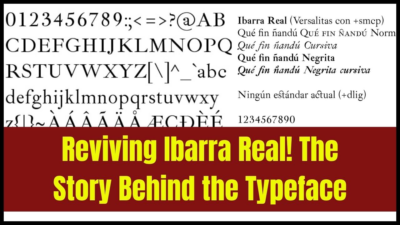
La tipografía Ibarra Real es una reinterpretación digital contemporánea de los tipos utilizados por Joaquín Ibarra, considerado el impresor más destacado del siglo XVIII en España. Su edición de El Quijote (Madrid, 1780), encargada por la Real Academia Española, es reconocida como una de las obras impresas más bellas de la historia europea.
Los tipos utilizados en aquella edición fueron grabados por Jerónimo Gil para la Imprenta Real, y representan la cima de la elegancia clásica, el equilibrio y la precisión en la tradición tipográfica española.
Una Letra Intemporal Renacida en la Era Digital
Más de dos siglos después, aquella forma tipográfica ha renacido como Ibarra Real: una fuente moderna que conserva la gracia de su herencia histórica y se adapta con naturalidad a los entornos digitales actuales. Su trazo sobrio, su ritmo equilibrado y su aire neoclásico siguen transmitiendo la misma dignidad visual que en tiempos de la Ilustración.
Una Iniciativa Cultural con Sello Institucional
El proyecto fue desarrollado bajo la dirección artística de José María Ribagorda, diseñador gráfico y profesor universitario especializado en tipografía. Liderado por la Calcografía Nacional —dependiente de la Real Academia de Bellas Artes de San Fernando, en Madrid—, contó además con el apoyo del Ministerio de Industria, Turismo y Comercio, la Agencia Española de Cooperación Internacional y la colaboración tecnológica de Microsoft.
Este respaldo institucional refleja el compromiso de España con la preservación y difusión de su legado visual, y su voluntad de ponerlo al servicio de la ciudadanía en la era digital.
Diseño y Desarrollo: Tradición, Investigación y Oficio
La creación de Ibarra Real fue mucho más que un ejercicio técnico. Supuso un proceso riguroso de reconstrucción artística y documental. Ribagorda y su equipo realizaron un minucioso trabajo de investigación, analizando grabados originales, impresiones de época y detalles morfológicos para capturar fielmente las proporciones, contrastes y ritmo visual del tipo del siglo XVIII.
El resultado fue una tipografía digital completamente funcional, que incluye:
- Estilos romano e itálico, optimizados para impresión y pantalla
- Juego completo de caracteres latinos con signos diacríticos
- Glifos ornamentales y viñetas decorativas diseñadas por artistas contemporáneos como homenaje a los adornos originales de la Imprenta Real
La fuente conserva la estructura humanista y el eje vertical característicos de su tiempo, a la vez que cumple con las exigencias técnicas de la tipografía del siglo XXI.
Libre y Abierta para Todos
Uno de los valores centrales del Proyecto Ibarra Real fue su vocación pública y libre de acceso. Desde sus inicios, la fuente estuvo disponible gratuitamente a través de este sitio web, ibarrareal.es, y se ofreció sin coste alguno a diseñadores, editoriales, docentes, instituciones culturales y usuarios particulares.
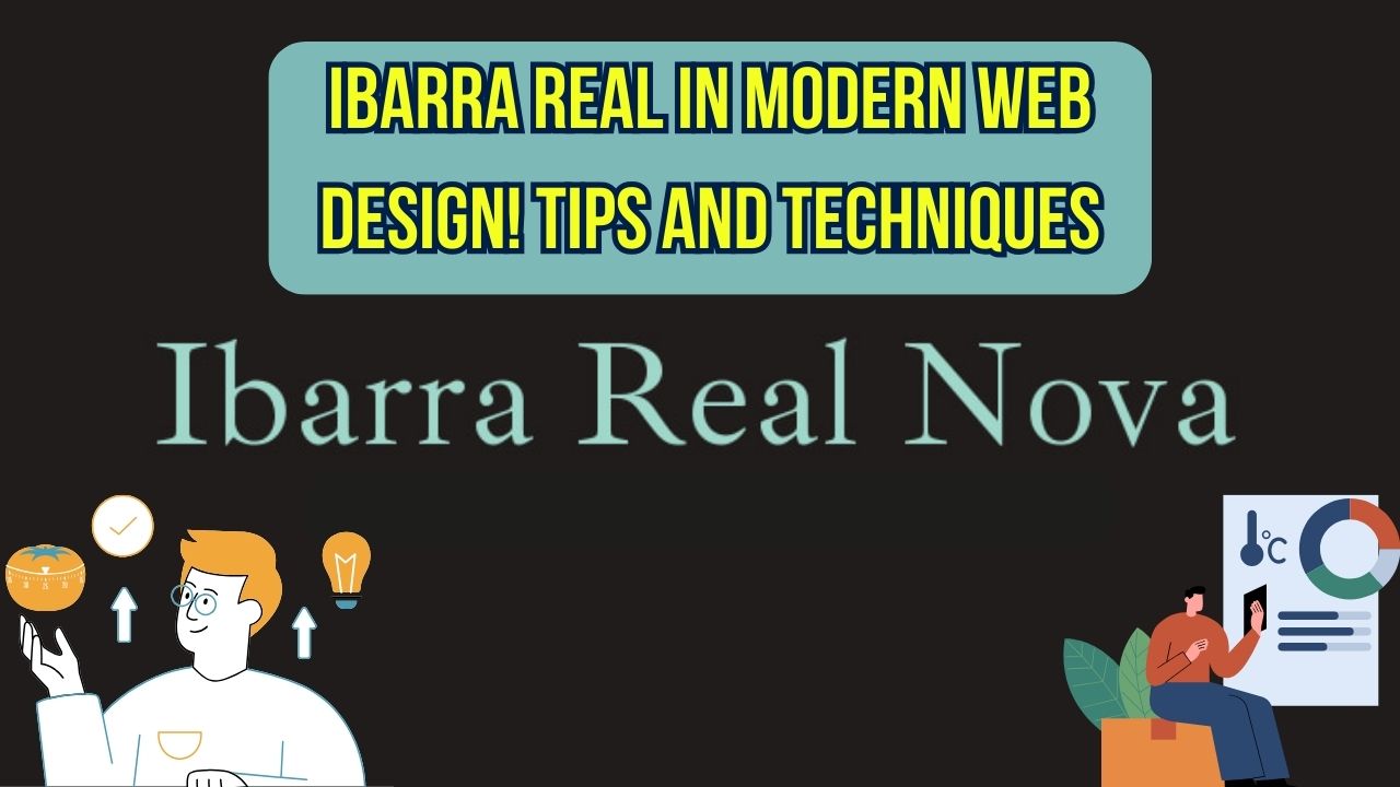
En el año 2018, la tipografía fue publicada bajo la SIL Open Font License y pasó a denominarse Ibarra Real Nova. Desde entonces, se encuentra alojada en Google Fonts, en GitHub y en la página web de la Real Academia de Bellas Artes, garantizando así su continuidad, evolución y uso abierto para las nuevas generaciones de creadores.
Resumen del Proyecto Ibarra Real
| Aspecto | Detalles |
|---|---|
| Nombre | Ibarra Real / Ibarra Real Nova |
| Origen | Basado en los tipos de la edición de Don Quijote (Madrid, 1780) |
| Diseñador | José María Ribagorda |
| Instituciones implicadas | Real Academia de Bellas Artes, Ministerio de Industria, Microsoft, AECID |
| Lanzamiento inicial | 2006 |
| Estilos tipográficos | Romano, Itálico, viñetas ornamentales |
| Licencia de distribución | Gratuita y de código abierto desde 2018 (SIL Open Font License) |
| Disponibilidad | Google Fonts, GitHub, Real Academia de Bellas Artes |
| Legado | Usada internacionalmente en libros, exposiciones y medios educativos |
Un Legado que Sigue Vivo
Aunque el sitio original ibarrareal.es ha cesado su actividad como plataforma principal, su misión ha sido cumplida con creces. La tipografía Ibarra Real Nova circula hoy libremente en internet y es utilizada en proyectos editoriales, publicaciones académicas y exposiciones culturales dentro y fuera del ámbito hispanohablante.
Hoy en día, Ibarra Real Nova no es solo una reconstrucción histórica: es una tipografía viva y útil, que conecta el pasado con el presente, y que continúa transmitiendo el refinamiento y la identidad visual de la tradición editorial española.