Joaquín Ibarra, one of the most influential figures in 18th-century Spanish printing, transformed the art of typography and book production, bringing unparalleled elegance and precision to the world of print. Operating from Madrid, Ibarra’s work was characterized by its meticulous craftsmanship and artistic design, setting new standards for printed works. His legacy continues to impact the world of typography and printing today. This article explores his life, his innovative contributions to the craft, and his lasting influence on both Spanish and global printing traditions.
Key Highlights
| Key Fact | Details |
|---|---|
| Full Name | Joaquín Ibarra y Marín |
| Born | 1725, in Spain |
| Died | 1785, in Madrid, Spain |
| Major Works | Don Quijote de la Mancha (1780), Diccionario de la lengua castellana (1780) |
| Innovations | Developed new ink formulas, refined paper techniques, and improved typographic standards |
| Legacy | Revolutionized Spanish printing with luxurious editions, influencing printing worldwide |
| Notable Typefaces | “Ibarra” typeface, used in his 1772 edition of Sallust |
| Official Website | Real Academia Española |
Joaquín Ibarra was more than just a printer; he was a visionary who elevated Spanish printing to the highest level of artistic and technical achievement. Through his work, he left an indelible mark on the craft, introducing innovations that have influenced the world of typography and publishing for centuries. His books were not only functional objects but also works of art, setting new standards for printed materials. Today, Ibarra’s legacy continues to inspire printers, typographers, and bibliophiles worldwide, ensuring that his contributions to the world of print will never be forgotten.
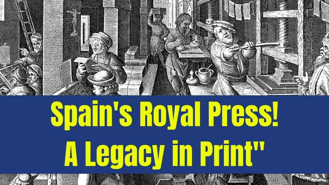
The Life of Joaquín Ibarra
Joaquín Ibarra was born in 1725 in Spain and became one of the most esteemed printers of his era. His journey into the world of printing began in Madrid, where he initially worked as an apprentice. He quickly gained a reputation for his talent and precision in producing high-quality printed works. By the mid-1750s, he established his own printing press, setting the stage for his rise to prominence.
In 1754, Ibarra was appointed the official printer for the Spanish royal family and the Royal Academy of the Spanish Language. This role allowed him to print books for the Spanish monarchy and its elite, cementing his place as one of the most important figures in the Spanish printing industry.
Joaquín Ibarra’s Revolutionary Approach to Printing
The Rise of Typographic Excellence
Before Ibarra, Spanish printing was functional but lacked the finesse seen in other European countries like France and Italy. Ibarra aimed to change this by merging the practicality of printing with the artistry of book design. His focus on both the functional aspects of printing and the aesthetic elements of books set him apart from other printers of his time.
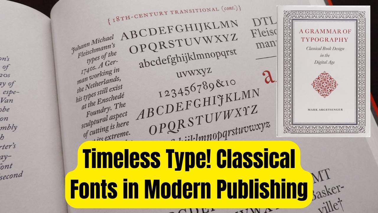
One of the defining features of Ibarra’s work was his emphasis on typographic beauty. He was known for choosing fonts that not only suited the content of the text but also contributed to the overall visual experience of the reader. The result was a harmonious blend of readability and elegance that has made Ibarra’s books highly regarded by bibliophiles and scholars alike.
Notable Works and Publications
- Don Quijote de la Mancha (1780): This edition, one of Ibarra’s most celebrated works, was commissioned by the Real Academia Española. It is widely considered one of the finest editions of Cervantes’ masterpiece, with custom-made paper, detailed engravings, and a refined typeface. The work’s elegant presentation and quality of print have made it a standard-bearer for high-end editions of literary classics.
- Diccionario de la Lengua Castellana (1780): Another cornerstone of Ibarra’s legacy, this massive dictionary was the most comprehensive of its time. It was printed with a high level of precision and care, setting a new benchmark for scholarly works in the Spanish-speaking world.
- La Conjuración de Catilina y la Guerra de Jugurtha (1772): In this limited edition, Ibarra’s press produced just 120 copies, each lavishly designed with beautiful engravings. This rare book was commissioned for the Spanish royal family, reflecting Ibarra’s skill at creating works fit for royalty.
Innovations in Printing Techniques
Ibarra’s impact on the world of printing was not limited to the aesthetic quality of his books. He was a true innovator, experimenting with new techniques and refining existing ones to produce prints that were more durable, vibrant, and elegant than ever before.
New Ink Formulas and Paper Innovations
Ibarra developed a special ink formula that produced prints with vivid colors that lasted longer than traditional inks. His ink formula was resistant to fading, even with prolonged exposure to light. This was particularly important for works that were intended for long-term preservation, such as those printed for the Spanish royal family.
In addition to improving ink, Ibarra also worked on refining paper finishes. He sought to minimize the plate marks that were commonly left on paper after printing. This innovation gave Ibarra’s books a smoother, more polished appearance. His work with paper and ink helped elevate Spanish printing to a level that could compete with the best in Europe.
Advancing Typographic Standards
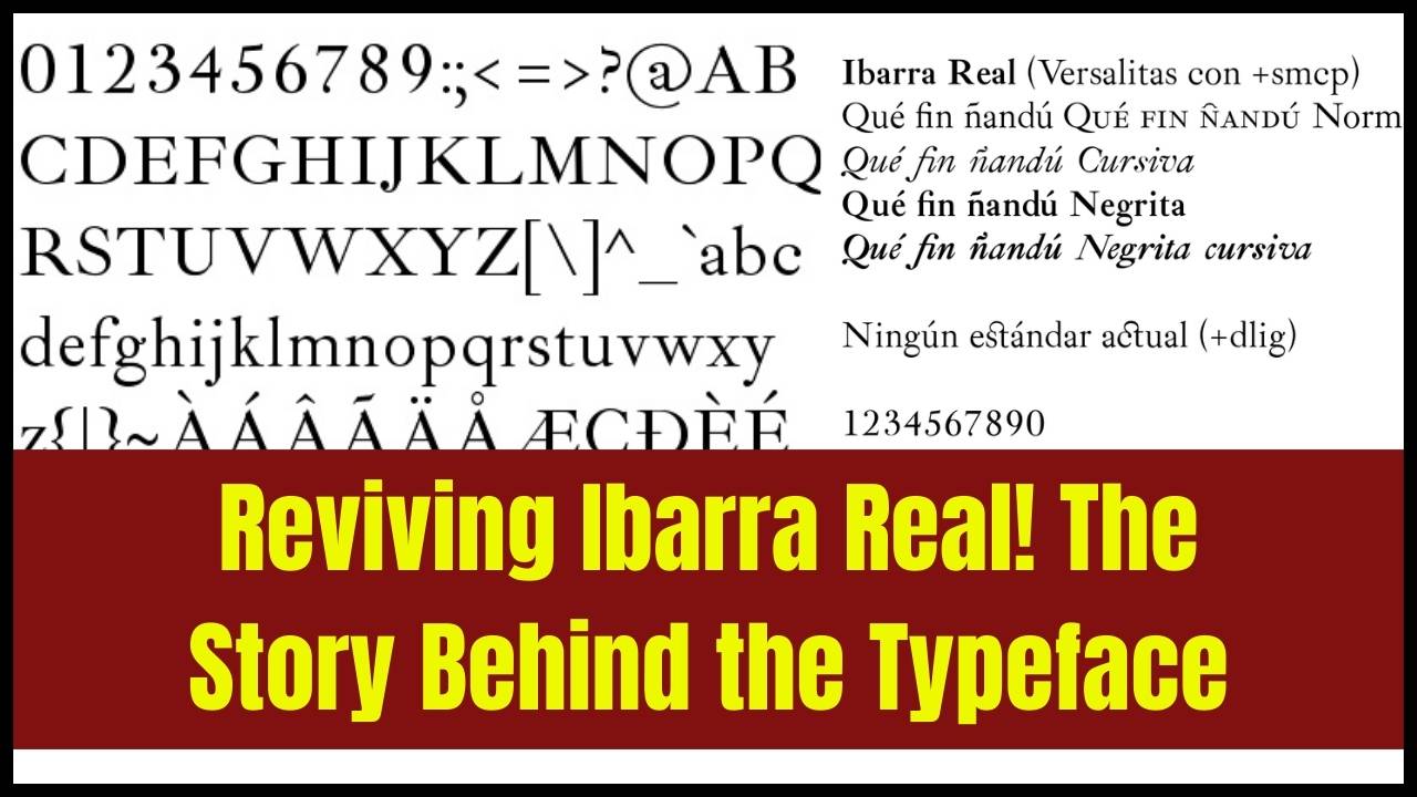
Ibarra’s impact on typography was just as significant as his work with printing technology. He did not design his own typefaces, but he played a critical role in popularizing the best typefaces of the time. One of his most famous contributions was his use of the “Ibarra” typeface, which was created by Antonio Espinosa de los Monteros. This typeface became synonymous with Ibarra’s work and is still regarded as one of the finest fonts of the 18th century.
Ibarra’s careful selection of typefaces, combined with his deep understanding of layout and design, allowed him to create books that were not only visually stunning but also easy to read. His work helped set the stage for modern typographic practices.
Joaquín Ibarra’s Lasting Influence
Impact on Modern Typography
The “Ibarra” typeface, developed by Espinosa de los Monteros, has remained a prominent choice for modern typographers. This typeface, with its refined curves and clear readability, is still in use today, especially for books that seek to emulate the elegance and craftsmanship of Ibarra’s time. The continued popularity of the “Ibarra” typeface is a testament to Ibarra’s ability to blend artistic design with practical utility.
Influence on Spanish Printing and Publishing
Ibarra’s work had a profound effect on the entire Spanish printing industry. His innovations set new standards for quality and aesthetics that other printers followed. His dedication to detail and artistic vision raised the bar for what was considered acceptable in the world of printed books.
In the wider world of publishing, Ibarra’s work had a lasting impact. By improving the quality of Spanish printed works, he ensured that Spain’s literary heritage could be preserved for future generations. His printing press became a model for printers in other countries, helping to elevate the global standards for book production.
Frequently Asked Questions (FAQs)
1. Who was Joaquín Ibarra?
Joaquín Ibarra was an 18th-century Spanish printer renowned for his contributions to the art of typography and book production. He is best known for his finely crafted editions of literary works, such as Don Quijote de la Mancha, and for his innovations in printing techniques.
2. What were some of Joaquín Ibarra’s most famous works?
Some of Ibarra’s most famous works include Don Quijote de la Mancha (1780), Diccionario de la Lengua Castellana (1780), and La Conjuración de Catilina y la Guerra de Jugurtha (1772).
3. What innovations did Joaquín Ibarra bring to printing?
Ibarra developed new ink formulas, refined paper finishes, and improved typographic standards. His innovations made books more durable and visually appealing, setting a new benchmark for the industry.
4. What is the “Ibarra” typeface?
The “Ibarra” typeface was created by Antonio Espinosa de los Monteros and used in Ibarra’s 1772 edition of Sallust. It is known for its elegance and readability and has been revived for modern digital use.